Finding a better way to visualise geographical data using Google Map? You surely don't want to miss this!
This tutorial covers the basics of Bubble Maps in Data Studio and a short tutorial on how to create the map chart with geo-coordinates.
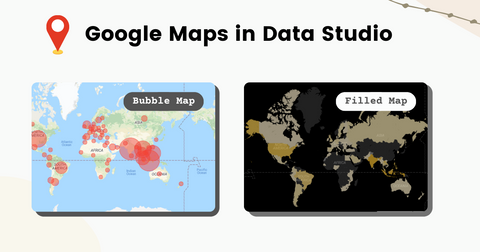
Map Charts in Looker Studio
People like map visualisations because they are easy to grasp, visually appealing, and entertaining! Maps are widely used to highlight particular regions that are notably different from others, as well as to demonstrate trends over numerous locations in a single piece of visual.
Looker / Data Studio has a great collection of map charts, consists of:
- two Google Maps charts, as shown in the infographics below, and
- one Geo Chart.
What is Bubble Map ?
Bubble Map consists of dots displayed over a map with the size of the circle being proportional to its value in the dataset.
This simply means each circle on a Bubble Map are plotted based on its geo coordinates, which is known as latitude and longtitude. The size of the dot represents the value of the chosen metrics; The higher the value, the bigger the circle is, and vice versa.
Supported Data Types
Specifically in Data Studio Maps collection, Bubble Maps is the only charts that supports latitude and longitude data types.
Common Use Cases
The usage of a bubble map to compare proportions across geographical areas is quite beneficial in various use cases like outlet performance comparison, global social-economic status and more.
How Bubble Map Works?
Bubble Map, or in general Google Maps chart, allows us to visualise location data in Google Maps.

Based on Data Studio Documentation, each Google Maps chart consists of 2 layers:
- background layer: displays Google Map interface
- data layer: displays data as bubbles or filled areas, depending on the configuration.
In Data Studio, we have the luxury of controling the presentation and appearance of the map charts, such as option to include landmarks and roads details, colour theme of the base map, size and colour of the bubbles, and many more!
All these configurations are available within chart properties, you may find out more in Google Data Studio Documentation.
Tutorial: Create Bubble Map using Geo Coordinates
Data Studio Bubble Maps supports a wide variety of field types, including but not limited to:
- Country
- City
- Region
- Coordinates: Latitudes and Longtitudes
In this tutorial, we would be focusing using latitude and longtitude geo coordinates as an example, as there are not enough resources about this amazing feature found on the web.
Learn better with video? Here you go!
Pre-Requisites
To create a geo map, you need to have a valid geo field in your dataset, regardless of your data sources. Or else you may get error message from Data Studio.
Good news for those who are using Google Analytics and Google Ads connector as data sources! Geo fields are automatically included and ready to use immediately. You may skip this part and move on to creating bubble map.
If you are using BigQuery or Google Sheets as the data source, you would want to make sure that the selected geographic fields uses the compatible format and data types.
In case you are unsure, this is the compatible format for geo coordinates to be recognised in Data Stuio:
latitude>,<longtitude>
Example values are : 3.1333333, 4.222222.
Configure Geo Field
Next, let’s configure the data source setting so that the field above are recognised as a Geo field in Data Studio:
Configure location data to Geo Data Type
Continue reading for written steps below.
- Edit the data source.
- Locate the geographic dimension(s) you want to use in Google Maps.
- Use the Type menu to select the appropriate Geo field type.
Now we have the data settings right, let’s proceed to add a bubble map in the reports.
3 steps to create Bubble Map
It’s very simple to create Bubble Map in Data Studio. Follow the steps below.
Step 1: Insert Bubble Map
Simply hit “Add a chart” and select Bubble Maps under Google Maps category.
Then, click on the blank canvas to add the chart.
Step 2: Add Geo Field
At the property panel on the right, drag-and-drop the geo field into Location field.
Step 3: Add Additional Info
Then, add a metric of your choice to Size parameter.
You may also choose to add the metric to Colour parameter if you wish to represent the metric value using colour gradient.
Note: Adding metrics to bubble map is optional.
Interact with Bubble Maps: Viewer Controls
In view mode, users can use map controls to interact with the map.
Zoom or Pan the Map.
Zooming
To zoom in to specific area, you could tap on the + sign on the map in View mode. The next time you open it’d be in the same size.
Alternatively, you may double click on the map to zoom in to specific area.
Panning
Move the map around by clicking and dragging the map to show different regions.
However, in some cases you may want to enable user to zoom in to specific country or city with just one click. I’m going to write another article to discuss on possible ways to interact with maps, if you are interested on the topic.
Embed Map in External Websites
[Update 2022-03-04: You can now embed a Google Map Chart in Data Studio! Watch the video below to learn how I do it.
at the time of writing this article, embedding map in external websites is not supported.
If you attempt to embed Data Studio Reports in your website, you would probably see error message like Google Maps cannot yet displayed in embedded reports..
However, you may vote on the requested features to help the developer team to prioritise what to build for Data Studio users.
Limitations
Given the convenience and ease of building bubble map in Data Studio, we can offer google maps-like experience in the reports!
However, it does come with some limitations:-
1. Limited Bubbles - Up to 1 million
For Bubble Map using Latitude and Longtitude fields, you may include up to 1 million bubbles.
By default, the maximum number of bubbles is set 100k bubbles, but you have the option to increase it to 1 million as you wish.
Note: Increasing the bubbles limit is at the trade-off of reports' loading performance.
2. No drill down
One of the disadvantages of using Google Maps is that we are not allowed to drill up or down to city view, country view, continent view and etc.
Definitely check out Geo Charts if you are looking to provide this funtionality to users.
3. Limited Tooltip Information
Google Map, in general, allows to include only one field as the tooltip.
In case you are not familiar with the term tooltip, tooltip is the visuals that appear whenever users hover on the charts, it often displays additional information regarding the data point.
Take an example of outlet overview, when the outlet performance stands out from the rests, we may want to check out the outlet name, outlet manager, as well as outlet location.
However, we can’t include all these information in the map tooltip due to the limitation.
If you’d like to know what is the workaround, stay tune!
Summary
In conclusion, Google Maps in Data Studio provides endless possibilities of analysing data along with the nearby landmarks, you can now leverage on Google Maps functionality and bring your dashboard to the next level!
Personally, I see great potential of implementing this for retail outlets industry as it allows management to analyse whether there are any new competitors around their outlet location to explain the sales performance.
If you’re interested to explore the possibilities of customizing the map visualisation, feel free to follow my youtube channel and turn on the notification so that you’ll get notified when the video is up!
See Also
More Map Visualisation Tutorial in Looker Studio!