Choosing the right colour palette is one of the simplest yet most powerful ways to elevate a Google Sheets template. Colour isn’t just decoration—it shapes how people feel, read, and interact with your data.
A well-designed palette improves readability, highlights important information, and creates a clear visual hierarchy that guides the user’s attention.

More importantly, your colour palette should either match your brand identity or reflect the vibe and purpose of the spreadsheet. For example, a financial dashboard benefits from calm, professional tones, while a personal habit tracker may feel more approachable with soft pastels.
When your colours align with your brand, your templates instantly feel cohesive, polished, and recognizable.
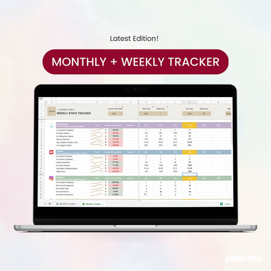
In this article, we’ll show you 4 ready-to-use Google Sheets colour palettes—Pastel, Earth, Business Blue, and Black & White—along with sample templates for each.
You’ll also learn which Google Sheets elements can be customised with colour, how to apply palettes effectively using the Theme feature, and tips to make your templates consistent, professional, and on-brand.
Btw, if you’re unsure which colours best represent your brand or the mood you want to convey, Pocodash offers a customisation service to tailor your template using your exact brand colours and company values —so your spreadsheets look as good as they work.
Why Custom Theme Matter in Google Sheets
A thoughtfully chosen colour palette does more than make your sheet look attractive—it impacts usability and perception in various ways that most people often overlooked:
- Enhances readability & data clarity: Well-chosen colours guide the eye through tables, highlight key metrics, and make complex data easier to digest.
- Reinforces branding & professionalism: Templates aligned with your brand colours create consistency across reports, dashboards, and presentations.
- Sets the look-and-feel: The right colours communicate mood and tone—calm, playful, energetic, or corporate.
- Improves overall user experience: Colours reduce cognitive load and make your sheets more intuitive to navigate.
Choosing the Right Colour Palette
When selecting a colour palette for Google Sheets, consider these principles:
-
Match your brand colours: Use your primary and secondary brand colours for headers, highlights, or charts to reinforce brand identity.
-
Fit the purpose of the sheet: A KPI dashboard benefits from professional blues and grays, while a lifestyle tracker might use soft pastels.
-
Accessibility & contrast: Ensure that text stands out against backgrounds and that your palette is colour-blind friendly.
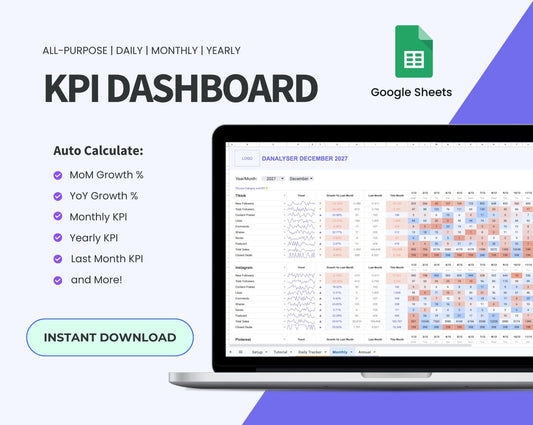
4 Google Sheets Colour Palettes Ideas + Hexcodes
Here are four carefully curated palettes that we use in our own paid templates, now made available for you to use for free, along with sample templates to help you see them in action.
Pastel Palette
Soft, friendly, and approachable, the Pastel Palette is perfect for personal projects where a light, calming vibe is needed. It’s ideal for templates that aim to be visually soothing while keeping your data clear.

-
Mood: Soft, friendly, approachable
-
Best use: Personal trackers, habit planners, lifestyle templates
-
Why it works: Gentle tones reduce visual fatigue while highlighting key data without overwhelming the user
-
Sample template: A habit tracker with pastel progress bars and section highlights

Earth-Tone Palette
Inspired by nature, the Earth Palette uses warm, grounded tones to create a sense of stability and calm. It works wonderfully for templates related to wellness, projects, or any context where a natural, balanced look is desired.

-
Mood: Warm, grounded, natural
-
Best use: Wellness trackers, project planning, non-profits reporting dashboards
-
Why it works: Creates a sense of stability and calm, ideal for holistic or nature-themed projects
-
Sample template: A project planner with earthy headers, category tags, and conditional formatting

Business Blue Palette
Blue is often associated with trust, stability, and professionalism, making it ideal for corporate dashboards and reports.

-
Mood: Professional, structured, trustworthy
-
Best use: Financial dashboards, KPI reporting, client presentations
-
Why it works: Conveys professionalism and reliability while keeping data clear and readable
-
Sample template: A sales KPI dashboard with blue-gradient conditional formatting and clear charts

Black & White Palette
Clean, minimalist, and high contrast, the Black & White Palette is all about clarity. It’s ideal for analytics-focused sheets or templates that prioritize data over decoration.
-
Mood: Clean, minimalist, high contrast
-
Best use: Analytics-focused sheets, printing-friendly templates
-
Why it works: Maximum clarity and contrast, letting the data itself take center stage
-
Sample template: A financial summary with monochrome charts, bold headers, and structured tables

How to Customize Colour Theme in Google Sheets
In Google Sheets, a Theme is a preset group of colours, fonts, and background styles applied to the entire file. The key to a polished, consistent spreadsheet is to set your theme colours before you start editing. When you do this, Google Sheets automatically applies your palette across the entire template, including tables, charts, conditional formatting, and hyperlinks.
Steps to Edit Colours Using Google Sheets Themes
-
Go to Format → Theme: Open the Theme panel in Google Sheets. In the window, click "Customise" to customise further.
-
Select colour using color picker or enter hexcodes for
-
text colours
- Background colour (for charts)
-
accent colours (1–6)—these control chart series, conditional formatting, and highlights.
-
hyperlink text colour
-
-
Start Editing: Once the theme is set, any new elements you add—charts, tables, or formatted cells, they will automatically use your theme colours.
Pro Tip: Always set your theme colours first. This saves time and ensures a consistent, professional, and on-brand look across your entire spreadsheet.